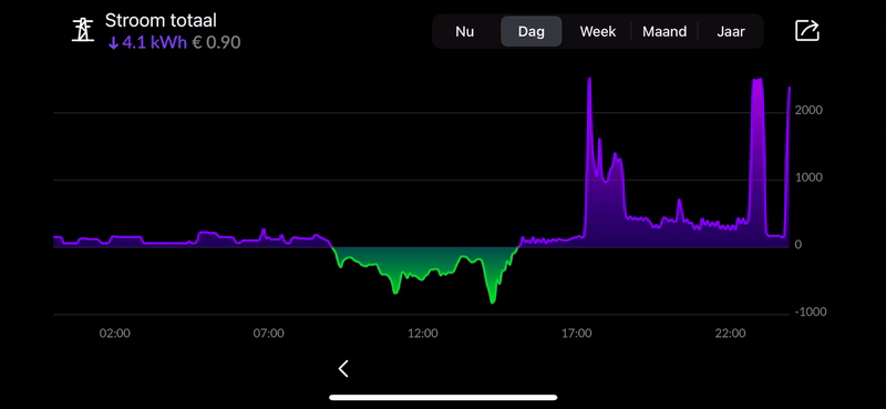
The Energy app is designed to show you your energy usage as accurately as possible. This is done through graphs. For every meter you install you get a detailed graph in the energy app.
Graph types
- ‘Now’ shows you your live energy usage.
- ‘Day’ shows a day's data with a 5 minute resolution.
- ’Week' shows a week's data with a day resolution.
- ‘Month’ shows all weeks within the selected month.
- ‘Year’ shows a full year with a month resolution.
- 'Purple' shows your energy usage.
- 'Green' shows your injection (P1 meter) or production (kWh meter).
- 'Rood' shows your gas usage.
Graph details
Clicking on a graph shows you more detailed information. The screen will turn to utilize the full screen. You can tap on the graph to bring up a slider showing you the exact usage for the selected time.
Turning the phone back to the original position will exit the full screen graph.
Graph position
Using multiple meters will give you multiple graphs on your home screen. You can arrange these graphs under settings > graphs > edit.
Graph size
There are 4 different sizes for graphs; mini, small, medium and large. You can change the size of your graph under settings > graphs > 'graph' > size.
Graph name
While installing a meter you can enter a name for your graph. You can change this name under settings > graphs > 'graph' > name.
Was this article helpful?
That’s Great!
Thank you for your feedback
Sorry! We couldn't be helpful
Thank you for your feedback
Feedback sent
We appreciate your effort and will try to fix the article